
Included below is a sample of some of our frameworks and data visualizations
The AIM team uses various techniques to support the visualizations of complex datasets. Included below are a few examples.
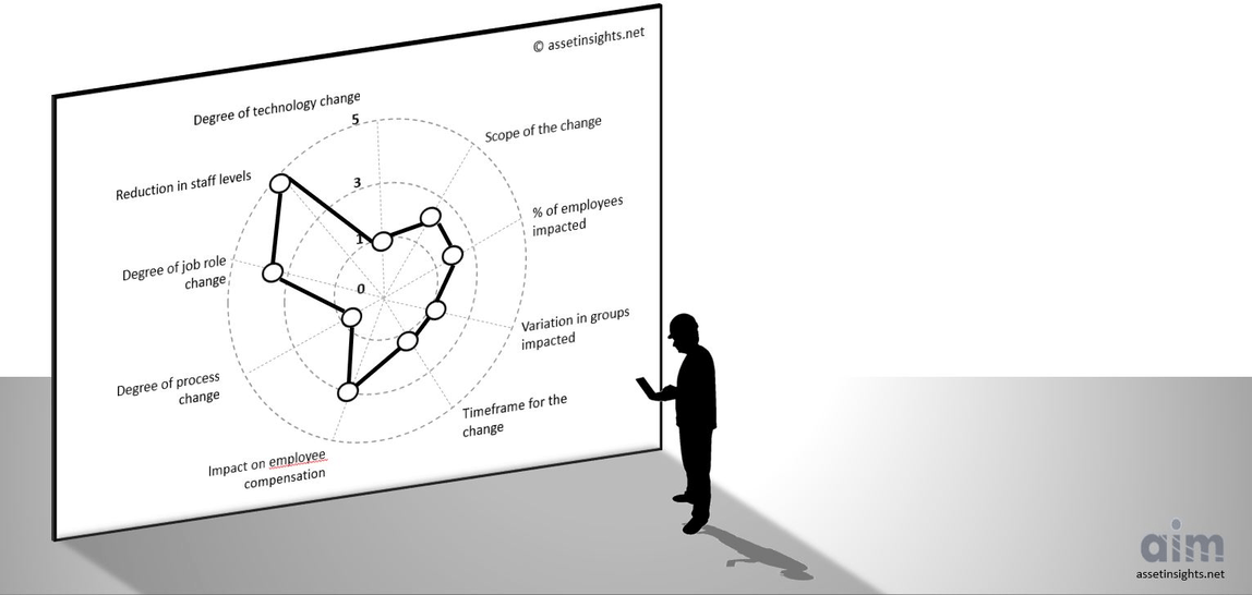
Radar Charts for Gap Analyses
Also known as a spider diagram, these charts provide a graphical method of displaying multivariate data in the form of a two-dimensional chart of three or more quantitative variables represented on axes starting from the same point.
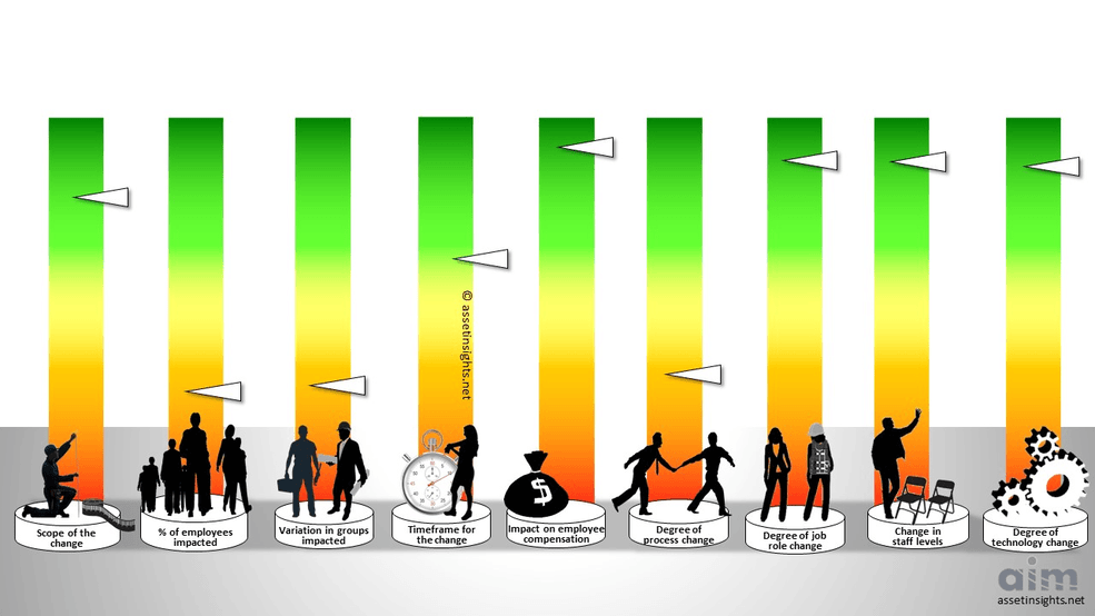
Multiple Parallel Plots to Reveal Multi-Criteria Scores
A visualization technique used to plot individual data elements across many performance measures. Each of the measures corresponds to a vertical axis and each data element is displayed as a series of connected points along the measure/axes.
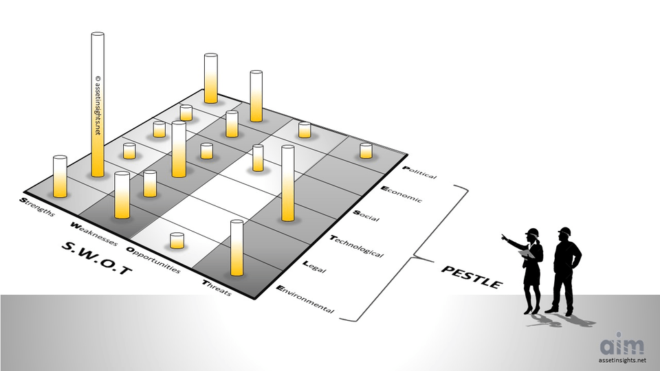
SWOT-PESTLE Analysis for Context Scanning
The 24 cells in the matrix are used to develop a cluster analysis that informs the organization on where to focus the strategic initiatives.
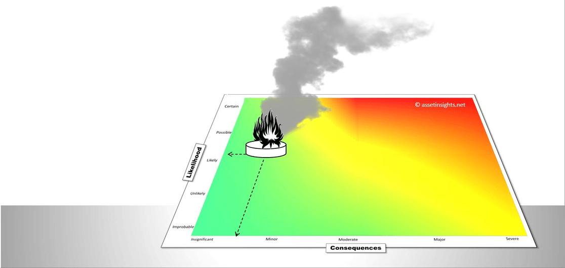
Risk Exposure Matrix
A matrix to correlate the likelihood (vertical, y-axis) of an asset failure relative to the impact when it does (horizontal, x-axis). The product of the two axes is the risk score, which is intuitively revealed through the heat map layered into the matrix.
Chord Diagrams to Map Interrelationships
A chord diagram is a graphical method of displaying the myriad of inter-relationships between data in a matrix. Line thickness is used to emphasis the strength of the relationships.
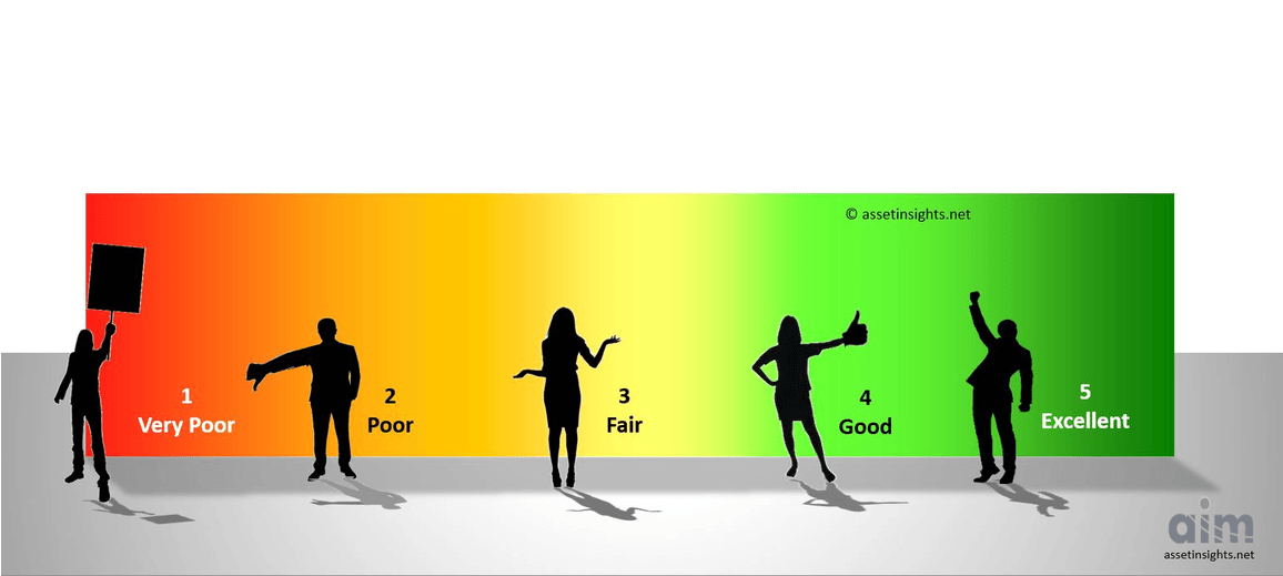
Spectrums for Grading Scales
A heat mapped spectrum provides an impactful means of intuitively representing data points along a continuum. This method is often used in asset management for condition grading of the assets on a 5-point scale.
Contact our office to learn more about how we use these (any many other) techniques in our process of helping organizations visual-ize asset management in order to vision-ize their teams.